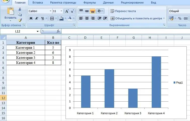
Microsoft Excel allows you to create clear and colorful charts. Moreover, depending on the types of data, different types of diagrams are provided, which makes it possible to present almost any digital information as clearly as possible.

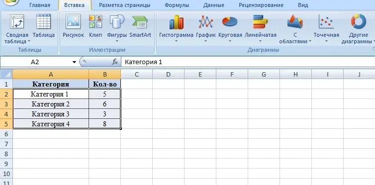
In order to build a diagram in Microsoft Excel, you need to create a data table in the file.

As an example, let's take a block of four categories, in the next column we put down the values of these categories. The numbers in the second column serve as values for the future chart.
To draw up a diagram, you must enter the "Insert" tab and select one of several subgroups of diagrams.
- Bar charts are a type of charts that allows you to present a comparison of the same type of data (for example, comparing the volume of sales of different divisions of the company, comparing the indicators of competitive enterprises, etc.). Bar charts can be used for similar purposes.
- Graph - allows you to display the dynamics of the process over time (growth in sales in comparison with previous periods, prospects for the implementation of programs, etc.).
- Pie chart - a type of charts that allows you to represent the components of the whole (presentation of data on the company's profits with differentiation by direction, etc.)
- Scatter Chart - Allows you to represent metrics on a plane.
Depending on the meaning of the values, you must select the type of chart. Next, the category and values are highlighted with the mouse. After that, in the "Insert" tab, the required subgroup is selected, and then - the diagram itself.

To make the chart even more visual, you can change the colors of each bar. To do this, double-click on the column with the left mouse button, thereby separating the selection of the column from others, and then call the context menu with the right mouse button. To change the parameters of the object, use the item "Data point format". In the dialog box that appears, in the Fill tab, select Solid fill for a solid color. Also, if necessary, the columns can be painted with a gradient, that is, by stretching several colors, or filled with a texture.
In addition, the Data Point Format tab allows you to change the type and color of the stroke, set effects such as the background and volume of objects.


